My top 10 cartography websites (and a comprehensive list)

Article publication date: 29th November 2024.

The internet is a marvel, but does it make us happier, with all the doom-scrolling, echo-chambers and polarised bickering? We should use it to share information and inspiration, and that’s exactly what my favourite cartography sites do. Here you’ll find 10 of the best (in no particular order), which showcase everything from exquisite hand-drawn masterpieces to cutting-edge interactive web maps. At the end there’s a more comprehensive list, with notes on how to follow all these creative folk. Take your time and enjoy their work!

The top 10

Shaded Relief
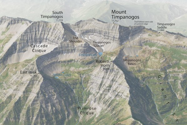
A cropped view of an oblique-view map of Mount Timpanogos in the Wasatch Range, Utah, USA, made by Tom Patterson. The map is a realistic representation of the mountain ridge as viewed from the northeast and slightly above the peak.

A crop of Patterson’s oblique-view map of Mount Timpanogos.

Tom Patterson spent most of his career as a cartographer for the US National Park Service, so he has a broad portfolio of handsome maps and a matching store of skill and wisdom. He shares all of it freely on his homepage, which has a mix of maps, tutorials and resources. He has produced several impressive and important reference maps, including as a major contributor to the Natural Earth project, which many people will recognise. His portfolio has many excellent oblique-view (perspective) maps and evocative representations of terrain, for example through shaded relief. He learnt to shade relief by hand, and in fact this was what first attracted him to cartography.


Dan Coe Carto
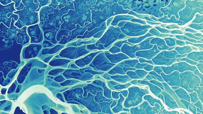
An artistic rendering of the topography of a portion of the Lena River, named “Lena River Veins” and created by Dan Coe. The topography is converted to a REM (relative elevation model) and rendered in shades of blue.

Coe’s Lena River Veins.

Dan Coe is a graphics editor for the Washington Geological Survey. His diagrams and perspective views make stunning use of high-resolution topographic data, which he processes to highlight relative elevation contrasts and presents in splendid colours. He has a keen eye for the most captivating landscapes which he also hones as a photographer.


Andy Woodruff
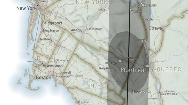
A screenshot from an interactive map of the 2024 North American Eclipse, created by Andy Woodruff. The map is designed such that the user can scroll downwards from the start of the eclipse, so that the orientation is rotated southwest-up. The area shown covers the north-eastern USA and Quebec. The eclipse’s path of totality is indicated by a shaded swath, and a darker ellipse indicates the region of total eclipse at a specific moment in time, which includes Montreal and Burlington.

A screenshot of Woodruff’s interactive map of the 2024 North American Eclipse.

Woodruff is a master of interactive maps, such as the example shown of the 2024 North American Eclipse. You should play around with the web maps in his blog, which also includes tutorials and static maps.


Eleanor Lutz
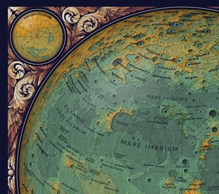
A cropped image of Eleanor Lutz’s Topographic Map of the Moon. The top-left part of a hemispheric view of topography is shown, with contours filled by hypsometric colours ranging from green-blue up to yellow-orange. Geological and geomorphological features are labelled. There is an inset showing the same map in north polar view. The margins are decorated with coppery-colour feather patterns.

A crop of Lutz’s Topographic Map of the Moon.

Lutz is an scientific illustrator whose work brings datasets to life through glorious, rich graphic design, in the form of maps, animations, infographics and drawings. She shares her methods and computer code as part of her blog, Tabletop Whale.


Wuslopebology
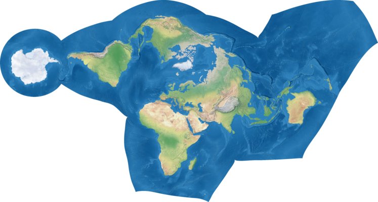
A physical world map shown using the unusual Elastic I projection, which uses interruptions to keep the continents in a contiguous group, and a spatially-variable metric to minimise distortion of these landmasses.

Kunimune’s Elastic I projection applied to a Natural Earth basemap.

I often daydream about inventing a new map projection, but I usually end up despondent, concluding that there is nothing new to be done. On the Wuslopebology blog, Justin Kunimune proved this is not the case, if you have sufficient imagination and technical skill. He devised the fascinating Elastic projections which go beyond the usual cones and ellipsoids. Unfortunately (for the cartographic community, that is!), the topic of map projections is just one of Kunimune’s interests, and the blog also features posts on constructed languages and nuclear physics. Nonetheless I look forward to seeing what else he will invent.


Evan Applegate
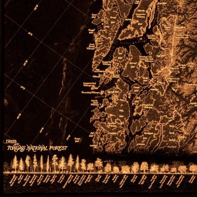
A cropped image of a backlit illuminated map entitled “Trees of the Tongass National Forest” by Evan Applegate. The map is monotone, with a black background and details shown by warm white-yellow light shining though with various levels of brightness. The region depicted shows an area of fjords adjacent to the ocean, with a rotated projection so the coast runs from the top to the bottom in a straight line. At the bottom there is marginalia showing the heights of different native trees.

A crop of one of Applegate’s unique backlit maps, Trees of the Tongass National Forest.

Evan Applegate says “The best maps are still to come, and you’re going to make them”. Cartography isn’t codified and many cartographers are fully or partially self-taught. He gives a lot of advice on this, as well as running a cartography podcast, writing a blog, listing cartographers’ work for sale and supporting a forum called the Spatial Community. When he’s not busy being a pillar of the community, Applegate works on inventive map formats such as backlit panels, and creates clear, carefully-laid-out thematic maps.


Eric Knight Maps
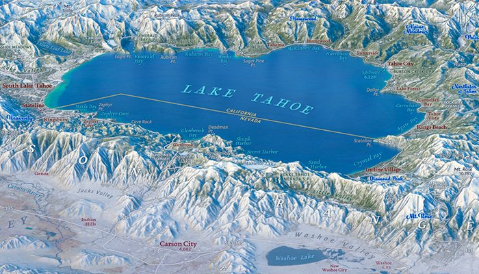
A cropped region of Eric Knight’s Lake Tahoe Panorama. The image is zoomed in on the lake itself, which is viewed from the west at a high altitude, with the Carson Range in the foreground. The map uses realistic colours and major geographic features are labelled.

Crop of Knight’s Lake Tahoe Panorama.

Eric Knight has perfected the panoramic map (also known as perspective or oblique-view map), and his website has many wonderful examples. Use them to get a feel for the topography of a region.


Jason Davies
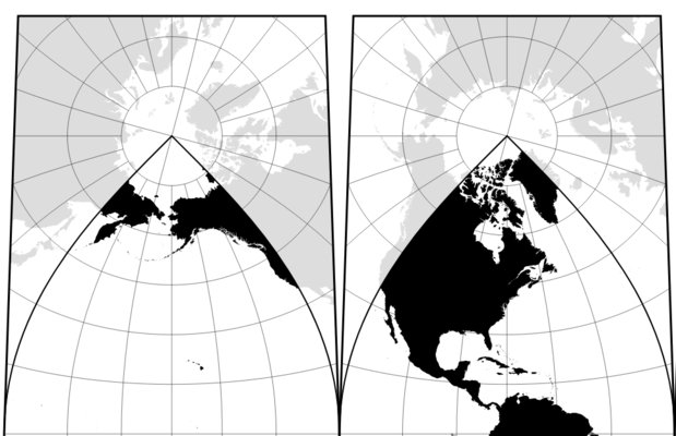
A screenshot showing top-left part of an Interrupted Transverse Mercator map produced by Jason Davies. In this projection, the world is shown split over four gores having different projection poles, with land in black and ocean in white. To minimise the visual disruption caused by the map interruption, the landmass for part of the duplicated regions which extend outside the domain of each gore is shown in grey.

A cropped screenshot of Davies’ Javascript-rendered Interrupted Transverse Mercator map.

Davies’ website is simply a portfolio of crisp maps, often with interesting projections, plus mathematical figures, all typically rendered on the fly using JavaScript. This allows many of them to be interactive, such as his world capital city Voronoi map.


Alex Hotchin
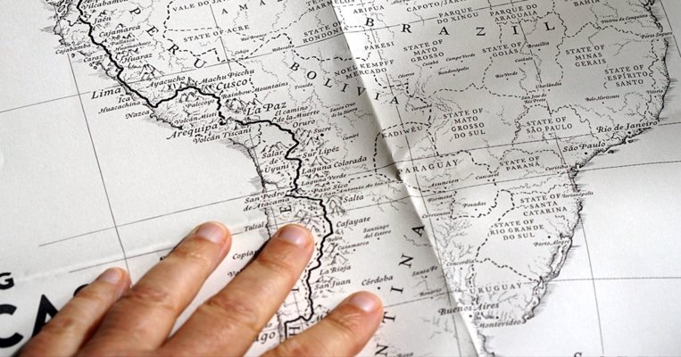
A photo showing part of the “Two Years on a Bike” map poster by Alex Hotchin, zoomed in to the middle part of South America. The main feature is a solid black line illustrating the cycle route of Martijn Doolaard. The base map is black and white with major regions and physical features labelled. The poster shows creases from being folded up and is being held down by a person’s hand.

Crop of Hotchin’s Two Years on a Bike poster.

Hotchin is a cartographer and illustrator. Her maps are often hand-drawn and watercoloured. Somehow they manage to be accurate and free, simultaneously. She often depicts long journeys undertaking by herself or others (in this example, she drew the journey of cyclist Martijn Doolaard).


somethingaboutmaps
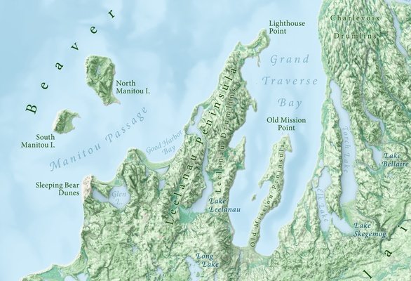
A small portion of the map “Landforms of Michigan” by Daniel Huffman. The image shows the area around the Leelanau Peninsula. The terrain is shown in green tints based on shaded relief, satellite imagery, and land texture, whilst the lakes are shown in shades of light blue according to bathymetry. The various geomorphological features are carefully labelled using curved text.

A crop of Huffman’s award-winning Landforms of Michigan.

The homepage of Daniel Huffman, a freelance cartographer and cartography instructor. Like a sushi chef who takes 10 years to master rice, Huffman’s mastery of labelling reflects his wider cartographic skill. In the example here, the labels feel natural and effortless, which belies the extraordinary patience and care required to place and balance the text. The labels have subtle haloes to help them nestle into the landscape, a technique perfected through Huffman’s characteristic process of painstaking experimentation. Every map has a unique aspect and a human story. His forthright blog is rich with tutorials, cartographic wisdom, and community initiatives, including salary surveys, a list of independent map sellers, helping to initiate the now-famous Atlas of Design (an annual cartography anthology), and a hand-printed cyanotype map which has been on a postal journey since 2019.

Even more sites, and what to do with them

I am a self-taught cartographer, like several of the others mentioned in this blog post. To start with, I was overwhelmed by all the resources and examples available. My reaction was to compile a list, so I could remember which sites I’d taken time to look at. I thought this list might be helpful for other people interested in cartography, so here it is:


My list of cartography websites (short link for sharing: hkuril.com/0000)


The goal is to list any website that does one or more of the following:

The scope generally does not include data repositories, archives of historical maps, or single-purpose web maps. The majority of the sites are the homepages and blogs of active, modern cartographers. Most are in English but any language is welcome. There is a short description. New sites are always being added. Please let me know of any more sites that should belong on the list. All suggestions, corrections, and comments are gratefully received. Please my contact details to contact me.

I’ve tried to indicate where social media accounts are available, to make it easier to keep up-to-date. You can use a feed reader such as Inoreader to follow web feeds.